We can split the Flutter widget into two categories:
- Visible (Output and Input)
- Invisible (Layout and Control)
Visible widget
The visible widgets are related to the user input and output data. Some of the important types of this widget are:
Text
A Text widget holds some text to display on the screen. We can align the text widget by using textAlign property, and style property allow the customization of Text that includes font, font weight, font style, letter spacing, color, and many more. We can use it as like below code snippets.
new Text(
'Hello, Javatpoint!',
textAlign: TextAlign.center,
style: new TextStyle(fontWeight: FontWeight.bold),
)
Button
This widget allows you to perform some action on click. Flutter does not allow you to use the Button widget directly; instead, it uses a type of buttons like a FlatButton and a RaisedButton. We can use it as like below code snippets.
//FlatButton Example
new FlatButton(
  child: Text("Click here"),
  onPressed: () {
    // Do something here
  },
),

//RaisedButton Example
new RaisedButton(
  child: Text("Click here"),
  elevation: 5.0,
  onPressed: () {
    // Do something here
  },
),
In the above example, the onPressed property allows us to perform an action when you click the button, and elevation property is used to change how much it stands out.
Image
This widget holds the image which can fetch it from multiple sources like from the asset folder or directly from the URL. It provides many constructors for loading image, which are given below:
- Image: It is a generic image loader, which is used by ImageProvider.
- asset: It load image from your project asset folder.
- file: It loads images from the system folder.
- memory: It load image from memory.
- network: It loads images from the network.
To add an image in the project, you need first to create an assets folder where you keep your images and then add the below line in pubspec.yaml file.
- assets:
- – assets/
Now, add the following line in the dart file.
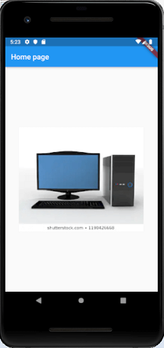
- Image.asset(‘assets/computer.png’)
The complete source code for adding an image is shown below in the hello world example.
class MyHomePage extends StatelessWidget {
  MyHomePage({Key key, this.title}) : super(key: key);
  // This widget is the home page of your application.
  final String title;

  @override
  Widget build(BuildContext context) {
    return Scaffold(
      appBar: AppBar(
        title: Text(this.title),
      ),
      body: Center(
        child: Image.asset('assets/computer.png'),
      ),
    );
  }
}
When you run the app, it will give the following output.
Icon
This widget acts as a container for storing the Icon in the Flutter. The following code explains it more clearly.
new Icon(
  Icons.add,
  size: 34.0,
)
Invisible widget
The invisible widgets are related to the layout and control of widgets. It provides controlling how the widgets actually behave and how they will look onto the screen. Some of the important types of these widgets are:
Column
A column widget is a type of widget that arranges all its children’s widgets in a vertical alignment. It provides spacing between the widgets by using the mainAxisAlignment and crossAxisAlignment properties. In these properties, the main axis is the vertical axis, and the cross axis is the horizontal axis.
Example
The below code snippets construct two widget elements vertically.
new Column(
  mainAxisAlignment: MainAxisAlignment.center,
  children: <Widget>[
    new Text(
      "VegElement",
    ),
    new Text(
      "Non-vegElement"
    ),
  ],
),
Row
The row widget is similar to the column widget, but it constructs a widget horizontally rather than vertically. Here, the main axis is the horizontal axis, and the cross axis is the vertical axis.
Example
The below code snippets construct two widget elements horizontally.
new Row(
  mainAxisAlignment: MainAxisAlignment.spaceEvenly,
  children: <Widget>[
    new Text(
      "VegElement",
    ),
    new Text(
      "Non-vegElement"
    ),
  ],
),
Center
This widget is used to center the child widget, which comes inside it. All the previous examples contain inside the center widget.
Center(
  child: new clumn(
    mainAxisAlignment: MainAxisAlignment.spaceEvenly,
    children: <Widget>[
      new Text(
        "VegElement",
      ),
      new Text(
        "Non-vegElement"
      ),
    ],
  ),
),
Padding
This widget wraps other widgets to give them padding in specified directions. You can also provide padding in all directions. We can understand it from the below example that gives the text widget padding of 6.0 in all directions.
Padding(
  padding: const EdgeInsets.all(6.0),
  child: new Text(
    "Element 1",
  ),
),
Scaffold
This widget provides a framework that allows you to add common material design elements like AppBar, Floating Action Buttons, Drawers, etc.
Stack
It is an essential widget, which is mainly used for overlapping a widget, such as a button on a background gradient.