It is the most frequently used grid layout in Flutter because here, we already know the grid’s size. It allows developers to specify the fixed number of rows and columns. The GriedView.count() contains the following properties:
crossAxisCount: It is used to specify the number of columns in a grid view.
crossAxisSpacing: It is used to specify the number of pixels between each child widget listed in the cross axis.
mainAxisSpacing: It is used to specify the number of pixels between each child widget listed in the main axis.
padding(EdgeInsetsGeometry): It is used to specify the space around the whole list of widgets.
scrollDirection: It is used to specify the direction in which the items on GridView scrolls. By default, it scrolls in a vertical direction.
reverse: If it is true, it will reverse the list in the opposite direction along the main axis.
physics: It is used to determine how the list behaves when the user reaches the end or the start of the widget while scrolling.
shrinkWrap: If it is false, the scrollable list takes more space for scrolling in scroll direction. It is not good because it wastage memory and reduces app performance. Therefore, we will wrap our children widgets using shrinkWrap by setting it to true to avoid memory leakage while scrolling.
Example
Let us understand it with an example to see how to create GridView in Flutter for creating grid lists. First, create a new project in the IDE you are using. Open the project, navigate to the lib folder, and replace the below code with the main.dart file.
import 'package:flutter/material.dart';

void main() {runApp(MyApp());}

class MyApp extends StatelessWidget {
  @override
  Widget build(BuildContext context) {
    return MaterialApp(
        home: Scaffold(appBar: AppBar(
          title: Text("Flutter GridView Demo"),
        ),
            body: GridView.count(
                crossAxisCount: 3,
                crossAxisSpacing: 4.0,
                mainAxisSpacing: 8.0,
                children: List.generate(choices.length, (index) {
                  return Center(
                    child: SelectCard(choice: choices[index]),
                  );
                }
                )
            )
        )
    );
  }
}

class Choice {
  const Choice({this.title, this.icon});
  final String title;
  final IconData icon;
}

const List<Choice> choices = const <Choice>[
  const Choice(title: 'Home', icon: Icons.home),
  const Choice(title: 'Contact', icon: Icons.contacts),
  const Choice(title: 'Map', icon: Icons.map),
  const Choice(title: 'Phone', icon: Icons.phone),
  const Choice(title: 'Camera', icon: Icons.camera_alt),
  const Choice(title: 'Setting', icon: Icons.settings),
  const Choice(title: 'Album', icon: Icons.photo_album),
  const Choice(title: 'WiFi', icon: Icons.wifi),
];

class SelectCard extends StatelessWidget {
  const SelectCard({Key key, this.choice}) : super(key: key);
  final Choice choice;

  @override
  Widget build(BuildContext context) {
    final TextStyle textStyle = Theme.of(context).textTheme.display1;
    return Card(
        color: Colors.orange,
        child: Center(child: Column(
            crossAxisAlignment: CrossAxisAlignment.center,
            children: <Widget>[
              Expanded(child: Icon(choice.icon, size:50.0, color: textStyle.color)),
              Text(choice.title, style: textStyle),
            ]
        ),
        )
    );
  }
}
In the above code, we have created a class for the items that we want to show in the grid and then add some data. Next, we have constructed the widget that we are going to show in the GridView.
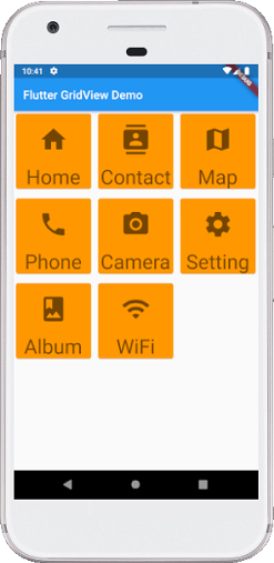
Output
When we run the app in Android Studio, we can see the following screen in our Emulator.