Sometimes we want to show a line or a paragraph with multiple styles such as bold, italicized, underlined, different color, different font or everything at once. In that case, we should have to use the RichText widget that allows us to perform multiple test styles without switching many widgets.
RichText is a very useful widget in Flutter, which is used for displaying a paragraph of text on the UI with multiple styles. Inside the widget, we can have different styles by giving it a tree of TextSpan widgets. Each TextSpan can set its own style for overriding the default style.
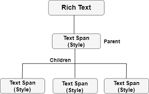
RichText Structure
The below image explains the structure of the RichText widget. In this image, the parent TextSpan has its own style property and a text parameter, and then it can contain several children TextSpan who have their own style property.
From the above overview, now we will see how to use this widget in our application.
Example
Suppose our app has a login screen and an option to create a new user account. The creation of new user account section has a combination of regular text and colored text, as shown in the below screen:
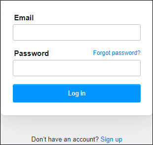
In the above image, we can see the text “Don’t have an account? Sign up” is a single line text, where the last part is a clickable word that navigates the user on the sign-up page. To make this type of text, we will divide it into two parts. The first part uses the parent TextSpan and input the text “Don’t have an account?” with the black color. The second part uses the children TextSpan and input the text “Sign up” with a blue color. See the below code:
RichText(
    text: TextSpan(
        text: 'Don\'t have an account?',
        style: TextStyle(color: Colors.black, fontSize: 20),
        children: <TextSpan>[
            TextSpan(text: ' Sign up',
                style: TextStyle(color: Colors.blueAccent, fontSize: 20)
            )
        ]
    ),
),
Since the “Sign up” is a clickable text, so we need to implement onTap() action on this part. The TextSpan contains TapGestureRecognizer() that implement onTap() action. In our example, we will use the recognizer property to make the text tappable. Let us show the entire code snippet to understand it more clearly.
Create a new project in the IDE you are using. Open the project, navigate to the lib folder, and replace the below code with the main.dart file.
import 'package:flutter/material.dart';
import 'package:flutter/gestures.dart';
void main() { runApp(MyApp()); }
class MyApp extends StatelessWidget {
@override
Widget build(BuildContext context) {
return MaterialApp(
theme: ThemeData(
primarySwatch: Colors.green,
),
home: MyTextPage()
);
}
}
class MyTextPage extends StatelessWidget {
@override
Widget build(BuildContext context) {
return Scaffold(
appBar: AppBar(
title:Text("Rich Text Widget Example")
),
body: Container(
child: Center(
child: RichText(
text: TextSpan(
text: 'Don\'t have an account?',
style: TextStyle(color: Colors.black, fontSize: 20),
children: <TextSpan>[
TextSpan(text: ' Sign up',
style: TextStyle(color: Colors.blueAccent, fontSize: 20),
recognizer: TapGestureRecognizer()
..onTap = () {}
)
]
),
),
)
)
);
}
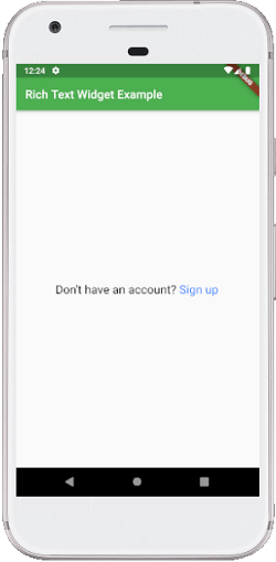
} Output:
When we run this application in the emulator or device, we should get the UI similar to the below screenshot:
How to show an icon in a text widget in Flutter?
Sometimes the developers need to show an icon with the text widget. To do this, Flutter provides a WidgetSpan() inside the RichText() widget to add an icon with the text widget. The below example explains it in a simple way:
import 'package:flutter/material.dart';
void main() { runApp(MyApp()); }
class MyApp extends StatelessWidget {
@override
Widget build(BuildContext context) {
return MaterialApp(
home: MyTextPage()
);
}
}
class MyTextPage extends StatelessWidget {
@override
Widget build(BuildContext context) {
return Scaffold(
appBar: AppBar(
title:Text("Rich Text Widget Example")
),
body: Container(
child: Center(
child:RichText(
text: TextSpan(
style: Theme.of(context).textTheme.body1,
children: [
TextSpan(text: 'Click ', style: TextStyle(fontSize: 25)),
WidgetSpan(
child: Padding(
padding: const EdgeInsets.symmetric(horizontal: 2.0),
child: Icon(Icons.add, color: Colors.red),
),
),
TextSpan(text: ' to add', style: TextStyle(fontSize: 25)),
],
),
)
)
)
);
}
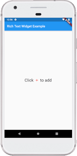
} Output:
When we run this application in the emulator or device, we should get the UI similar to the below screenshot: