The text widget constructor used to make the custom look and feel of our text in Flutter:
const Text(String data,{
    Key key,
    TextStyle style,
    StrutStyle strutStyle,
    TextAlign textAlign,
    TextDirection textDirection,
    TextOverflow overflow,
    bool softWrap,
    double textScaleFactor,
    int maxLines,
    String semanticsLabel,
    TextWidthBasis textWidthBasis,
    TextHeightBehavior textHeightBehavior
    }
)
The following are the essential properties of the Text widget used in our application:
TextAlign: It is used to specify how our text is aligned horizontally. It also controls the text location.
TextDirection: It is used to determine how textAlign values control the layout of our text. Usually, we write text from left to right, but we can change it using this parameter.
Overflow: It is used to determine when the text will not fit in the available space. It means we have specified more text than the available space.
TextScaleFactor: It is used to determine the scaling to the text displayed by the Text widget. Suppose we have specified the text scale factor as 1.5, then our text will be 50 percent larger than the specified font size.
SoftWrap: It is used to determine whether or not to show all text widget content when there is not enough space available. If it is true, it will show all content. Otherwise, it will not show all content.
MaxLines: It is used to determine the maximum number of lines displayed in the text widget.
TextWidthBasis: It is used to control how the text width is defined.
TextHeightBehavior: It is used to control how the paragraph appears between the first line and descent of the last line.
Style: It is the most common property of this widget that allows developers to styling their text. It can do styling by specifying the foreground and background color, font size, font weight, letter and word spacing, locale, shadows, etc. See the table to understand it more easily:
| Attributes | Descriptions |
|---|---|
| foreground | It determines the paint as a foreground for the text. |
| background | It determines the paint as a background for the text. |
| fontWeight | It determines the thickness of the text. |
| fontSize | It determines the size of the text. |
| fontFamily | It is used to specify the typeface for the font. For this, we need to download a typeface file in our project, and then keep this file into the assets/font folder. Finally, config the pubspec.yaml file to use it in the project. |
| fontStyle | It is used to style the font either in bold or italic form. |
| Color | It is used to determine the color of the text. |
| letterSpacing | It is used to determine the distance between the characters of the text. |
| wordSpacing | It is used to specify the distance between two words of the text. |
| shadows | It is used to paint underneath the text. |
| decoration | We use this to decorate text using the three parameters: decoration, decorationColor, decorationStyle. The decoration determines the location, decorationColor specify the color, decorationStyle determine the shape. |
import 'package:flutter/material.dart';
void main() { runApp(MyApp()); }
class MyApp extends StatelessWidget {
@override
Widget build(BuildContext context) {
return MaterialApp(
theme: ThemeData(
primarySwatch: Colors.green,
),
home: MyTextPage()
);
}
}
class MyTextPage extends StatelessWidget {
@override
Widget build(BuildContext context) {
return Scaffold(
appBar: AppBar(
title:Text("Text Widget Example")
),
body: Center(
child:Text(
"Hello World! This is a Text Widget.",
style: TextStyle(
fontSize: 35,
color: Colors.purple,
fontWeight: FontWeight.w700,
fontStyle: FontStyle.italic,
letterSpacing: 8,
wordSpacing: 20,
backgroundColor: Colors.yellow,
shadows: [
Shadow(color: Colors.blueAccent, offset: Offset(2,1), blurRadius:10)
]
),
)
),
);
}
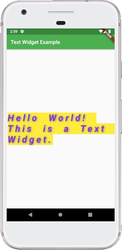
} Output:
When we run this application in the emulator or device, we should get the UI similar to the below screenshot: