We can categories the layout widget into two types:
- Single Child Widget
- Multiple Child Widget
Single Child Widgets
The single child layout widget is a type of widget, which can have only one child widget inside the parent layout widget. These widgets can also contain special layout functionality. Flutter provides us many single child widgets to make the app UI attractive. If we use these widgets appropriately, it can save our time and makes the app code more readable. The list of different types of single child widgets are:
Container: It is the most popular layout widget that provides customizable options for painting, positioning, and sizing of widgets.
Center(
  child: Container(
    margin: const EdgeInsets.all(15.0),
    color: Colors.blue,
    width: 42.0,
    height: 42.0,
  ),
)
Padding: It is a widget that is used to arrange its child widget by the given padding. It contains EdgeInsets and EdgeInsets.fromLTRB for the desired side where you want to provide padding.
const Greetings(
  child: Padding(
    padding: EdgeInsets.all(14.0),
    child: Text('Hello JavaTpoint!'),
  ),
)
Center: This widget allows you to center the child widget within itself.
Align: It is a widget, which aligns its child widget within itself and sizes it based on the child’s size. It provides more control to place the child widget in the exact position where you need it.
Center(
  child: Container(
    height: 110.0,
    width: 110.0,
    color: Colors.blue,
    child: Align(
      alignment: Alignment.topLeft,
      child: FlutterLogo(
        size: 50,
      ),
    ),
  ),
)
SizedBox: This widget allows you to give the specified size to the child widget through all screens.
SizedBox(
  width: 300.0,
  height: 450.0,
  child: const Card(child: Text('Hello JavaTpoint!')),
)
AspectRatio: This widget allows you to keep the size of the child widget to a specified aspect ratio.
AspectRatio(
  aspectRatio: 5/3,
  child: Container(
    color: Colors.bluel,
  ),
),
Baseline: This widget shifts the child widget according to the child’s baseline.
child: Baseline(
         baseline: 30.0,
         baselineType: TextBaseline.alphabetic,
         child: Container(
              height: 60,
              width: 50,
              color: Colors.blue,
         ),
)
ConstrainedBox: It is a widget that allows you to force the additional constraints on its child widget. It means you can force the child widget to have a specific constraint without changing the properties of the child widget.
ConstrainedBox(
  constraints: new BoxConstraints(
    minHeight: 150.0,
    minWidth: 150.0,
    maxHeight: 300.0,
    maxWidth: 300.0,
  ),
  child: new DecoratedBox(
    decoration: new BoxDecoration(color: Colors.red),
  ),
),
CustomSingleChildLayout: It is a widget, which defers from the layout of the single child to a delegate. The delegate decides to position the child widget and also used to determine the size of the parent widget.
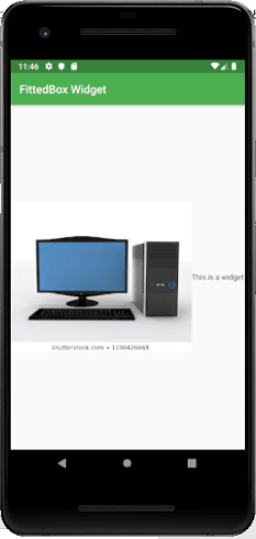
FittedBox: It scales and positions the child widget according to the specified fit.
import 'package:flutter/material.dart';

void main() => runApp(MyApp());

class MyApp extends StatelessWidget {
  // It is the root widget of your application.
  @override
  Widget build(BuildContext context) {
    return MaterialApp(
      title: 'Multiple Layout Widget',
      debugShowCheckedModeBanner: false,
      theme: ThemeData(
        // This is the theme of your application.
        primarySwatch: Colors.green,
      ),
      home: MyHomePage(),
    );
  }
}
class MyHomePage extends StatelessWidget {

  @override
  Widget build(BuildContext context) {
    return Scaffold(
        appBar: AppBar(title: Text("FittedBox Widget")),
        body: Center(
        child: FittedBox(child: Row(
          children: <Widget>[
            Container(
              child: Image.asset('assets/computer.png'),
              ),
              Container(
                child: Text("This is a widget"),
              )
            ],
          ),
          fit: BoxFit.contain,
        )
      ),
    );
  }
}
Output
FractionallySizedBox: It is a widget that allows to sizes of its child widget according to the fraction of the available space.
IntrinsicHeight and IntrinsicWidth: They are a widget that allows us to sizes its child widget to the child’s intrinsic height and width.
LimitedBox: This widget allows us to limits its size only when it is unconstrained.
Offstage: It is used to measure the dimensions of a widget without bringing it on to the screen.
OverflowBox: It is a widget, which allows for imposing different constraints on its child widget than it gets from a parent. In other words, it allows the child to overflow the parent widget.
Example
import 'package:flutter/material.dart';

void main() => runApp(MyApp());

class MyApp extends StatelessWidget {
  // It is the root widget of your application.
  @override
  Widget build(BuildContext context) {
    return MaterialApp(
      title: 'Single Layout Widget',
      debugShowCheckedModeBanner: false,
      theme: ThemeData(
        // This is the theme of your application.
        primarySwatch: Colors.blue,
      ),
      home: MyHomePage(),
    );
  }
}
class MyHomePage extends StatelessWidget {

  @override
  Widget build(BuildContext context) {
    return Scaffold(
      appBar: AppBar(
        title: Text("OverflowBox Widget"),
      ),
      body: Center(
      child: Container(
        height: 50.0,
        width: 50.0,
        color: Colors.red,
        child: OverflowBox(
          minHeight: 70.0,
          minWidth: 70.0,
          child: Container(
            height: 50.0,
            width: 50.0,
            color: Colors.blue,
            ),
          ),
        ),
      ),
    );
  }
}
Output
Multiple Child widgets
The multiple child widgets are a type of widget, which contains more than one child widget, and the layout of these widgets are unique. For example, Row widget laying out of its child widget in a horizontal direction, and Column widget laying out of its child widget in a vertical direction. If we combine the Row and Column widget, then it can build any level of the complex widget.
Here, we are going to learn different types of multiple child widgets:
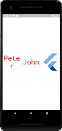
Row: It allows to arrange its child widgets in a horizontal direction.
Example
import 'package:flutter/material.dart';

void main() => runApp(MyApp());

class MyApp extends StatelessWidget {
  // It is the root widget of your application.
  @override
  Widget build(BuildContext context) {
    return MaterialApp(
      title: 'Multiple Layout Widget',
      debugShowCheckedModeBanner: false,
      theme: ThemeData(
        // This is the theme of your application.
        primarySwatch: Colors.blue,
      ),
      home: MyHomePage(),
    );
  }
}
class MyHomePage extends StatelessWidget {
  @override
  Widget build(BuildContext context) {
    return Center(
      child: Container(
        alignment: Alignment.center,
        color: Colors.white,
        child: Row(
          children: <Widget>[
            Expanded(
              child: Text('Peter', textAlign: TextAlign.center),
            ),
            Expanded(
              child: Text('John', textAlign: TextAlign.center ),

            ),
            Expanded(
              child: FittedBox(
                fit: BoxFit.contain, // otherwise the logo will be tiny
                child: const FlutterLogo(),
              ),
            ),
          ],
        ),
      ),
    );
  }
}
Output
Column: It allows to arrange its child widgets in a vertical direction.
ListView: It is the most popular scrolling widget that allows us to arrange its child widgets one after another in scroll direction.
GridView: It allows us to arrange its child widgets as a scrollable, 2D array of widgets. It consists of a repeated pattern of cells arrayed in a horizontal and vertical layout.
Expanded: It allows to make the children of a Row and Column widget to occupy the maximum possible area.
Table: It is a widget that allows us to arrange its children in a table based widget.
Flow: It allows us to implements the flow-based widget.
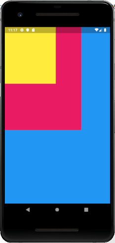
Stack: It is an essential widget, which is mainly used for overlapping several children widgets. It allows you to put up the multiple layers onto the screen. The following example helps to understand it.
import 'package:flutter/material.dart';

void main() => runApp(MyApp());

class MyApp extends StatelessWidget {
  // It is the root widget of your application.
  @override
  Widget build(BuildContext context) {
    return MaterialApp(
      title: 'Multiple Layout Widget',
      debugShowCheckedModeBanner: false,
      theme: ThemeData(
        // This is the theme of your application.
        primarySwatch: Colors.blue,
      ),
      home: MyHomePage(),
    );
  }
}
class MyHomePage extends StatelessWidget {
  @override
  Widget build(BuildContext context) {
    return Center(
      child: Container(
        alignment: Alignment.center,
        color: Colors.white,
        child: Stack(
          children: <Widget>[
            // Max Size
            Container(
              color: Colors.blue,
            ),
            Container(
              color: Colors.pink,
              height: 400.0,
              width: 300.0,
            ),
            Container(
              color: Colors.yellow,
              height: 220.0,
              width: 200.0,
            )
          ],
        ),
      ),
    );
  }
}
Output