The main concept of the layout mechanism is the widget. We know that flutter assume everything as a widget. So the image, icon, text, and even the layout of your app are all widgets. Here, some of the things you do not see on your app UI, such as rows, columns, and grids that arrange, constrain, and align the visible widgets are also the widgets.
Flutter allows us to create a layout by composing multiple widgets to build more complex widgets. For example, we can see the below image that shows three icons with a label under each one.
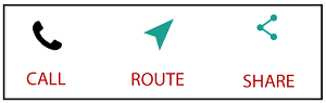
In the second image, we can see the visual layout of the above image. This image shows a row of three columns, and these columns contain an icon and label.
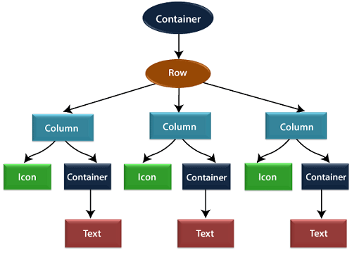
In the above image, the container is a widget class that allows us to customize the child widget. It is mainly used to add borders, padding, margins, background color, and many more. Here, the text widget comes under the container for adding margins. The entire row is also placed in a container for adding margin and padding around the row. Also, the rest of the UI is controlled by properties such as color, text.style, etc.
Layout a widget
Let us learn how we can create and display a simple widget. The following steps show how to layout a widget:
Step 1: First, you need to select a Layout widget.
Step 2: Next, create a visible widget.
Step 3: Then, add the visible widget to the layout widget.
Step 4: Finally, add the layout widget to the page where you want to display.